Public Sector · Usability Research
Navigating Municipal Services:a resident portal people could actually use
Overview
Mixed-methods usability research and redesign of a city's "My Digital" resident portal — streamlining payments, parking, services, and support across mobile and desktop.
My role
UX Researcher & Product Designer — research, testing, UX & UI.
Methods
Client
City municipality
.png)
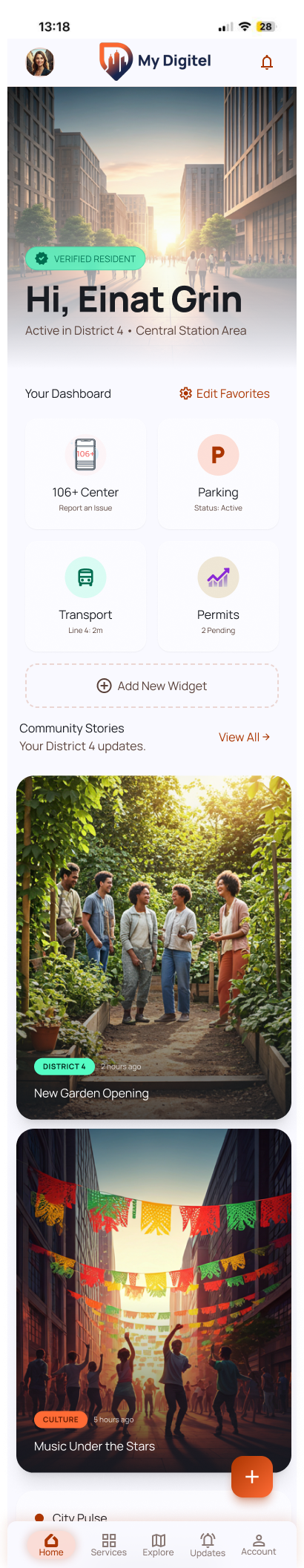
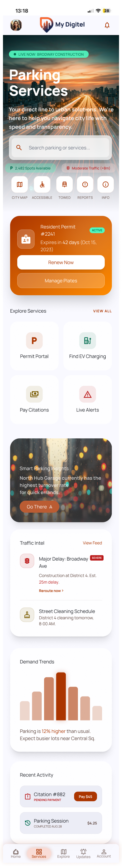
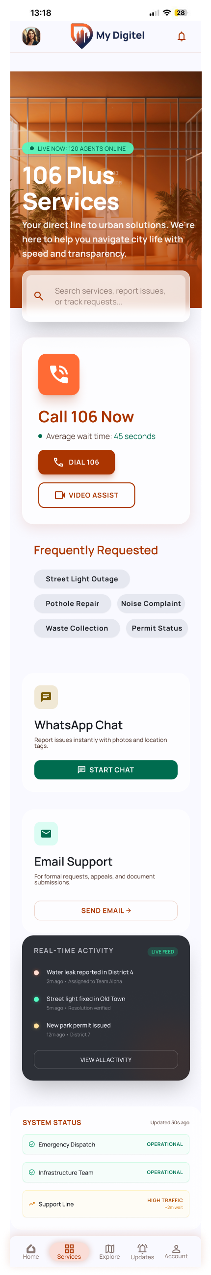
“My Digital” — the redesigned municipal resident portal.
The problem
A new digital portal — yet residents still picked up the phone.
“My Digital” was supposed to take load off the call center. It didn't. Residents would open it, hit a wall, and call anyway — so the real problem was never access to services. It was that the interface fought people at the exact moments they needed it.
Hard to navigate
Vague labels — a generic “Profile,” unclear sections — sent people hunting. Any task that spanned two screens lost them.
Impersonal & rigid
One identical home for every resident — nothing that reflected the handful of services a given person actually uses.
Disruptive integrations
Paying a fine bounced you to a separate site that re-asked for details you'd just entered — so people gave up.
The approach
How I tackled it
Mixed-methods research to learn where residents got stuck — and why they still reached for the phone.
Recruiting, personas & SWOT
Recruited representative residents, built personas, and ran a SWOT to frame the portal's real strengths and gaps.
Usability testing
Moderated and unmoderated task-based testing on the prototype to watch where orientation and flow actually broke.
Journey mapping & workshops
Design-Thinking workshops plus a full customer-journey map (below) to turn findings into prioritized design directions.
I mapped the full resident journey across the portal's key areas — general impression, exiting to external sites, profile, and traffic & parking — to pinpoint exactly where a positive first impression turned into friction.
.png)
Customer journey map — positives, pain points, and resident quotes across each area of “My Digital.”
What residents told us
From quotes to patterns
I clustered the findings into three themes — and each theme became one of the three design directions.
“It should feel like mine.”
Residents read the portal as the city's, not theirs — a generic “Profile,” no room to make it personal.
“Don't make me re-orient.”
Every screen change cost people their place, and labels named departments instead of tasks.
“One place, not a relay.”
Hand-offs to outside sites broke flow and trust, and re-asked for details people had just given.
The solution
Three fixes, where residents felt the friction
01
Personal, not one-size-fits-all
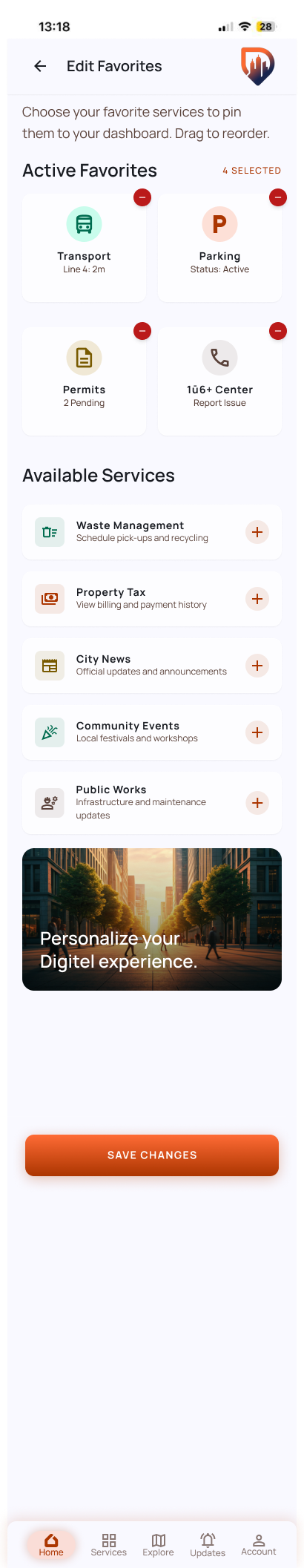
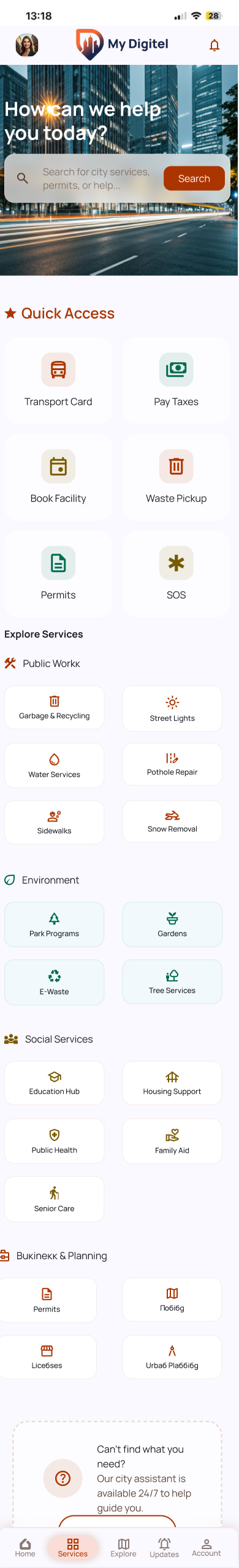
Residents kept telling me “Profile” felt cold and that they “expected more customization.” That reframed personalization from a nice-to-have into the trust fix. So the home became a dashboard people build themselves — pin the services you use, drop the rest, and choose how you're alerted (SMS, email, in-app).
02
Navigation you can't get lost in
In testing, people lost their place the moment a task crossed two screens. So I anchored one navigation bar on every page, added links inside each section, and renamed features to the words residents used — not internal department names. “Where am I?” stopped coming up.
03
One environment, start to finish
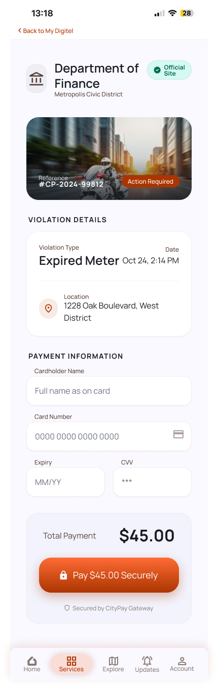
The sharpest drop-off was the hand-off to outside payment sites — new look, details re-typed, trust gone. So I kept those flows inside the app: same design, details carried over, a pop-up that never feels like leaving. Paying a citation is one task now, not three.
Interactive prototype
The redesign, in motion
A live walkthrough of the rebuilt portal — watch a resident skip the call center, pay a citation inside the app, and personalize their dashboard. It plays on its own; tap Interact to drive it yourself.
Visual design
Approachable but still official — Manrope for clear hierarchy, one warm orange to carry the brand, and greens and reds that only ever mean one thing: done, or needs your attention.
The impact
What changed
Residents now have a reason to finish a task in the portal instead of reaching for the phone.
Payments, parking, services, and support — rebuilt around clarity and orientation.
One language that holds together whether you're on the bus or at a desk.
Directional results from moderated and unmoderated usability sessions across mobile and desktop, segmented by age and device — a concept validated with residents, not production analytics.
“Now it actually feels like mine — I can find what I need without calling anyone.”
— Resident, usability session
Keep exploring
More case studies
Revolutionizing CX
A clearer research platform and an AI companion that turns weeks of synthesis into hours.
Read case study →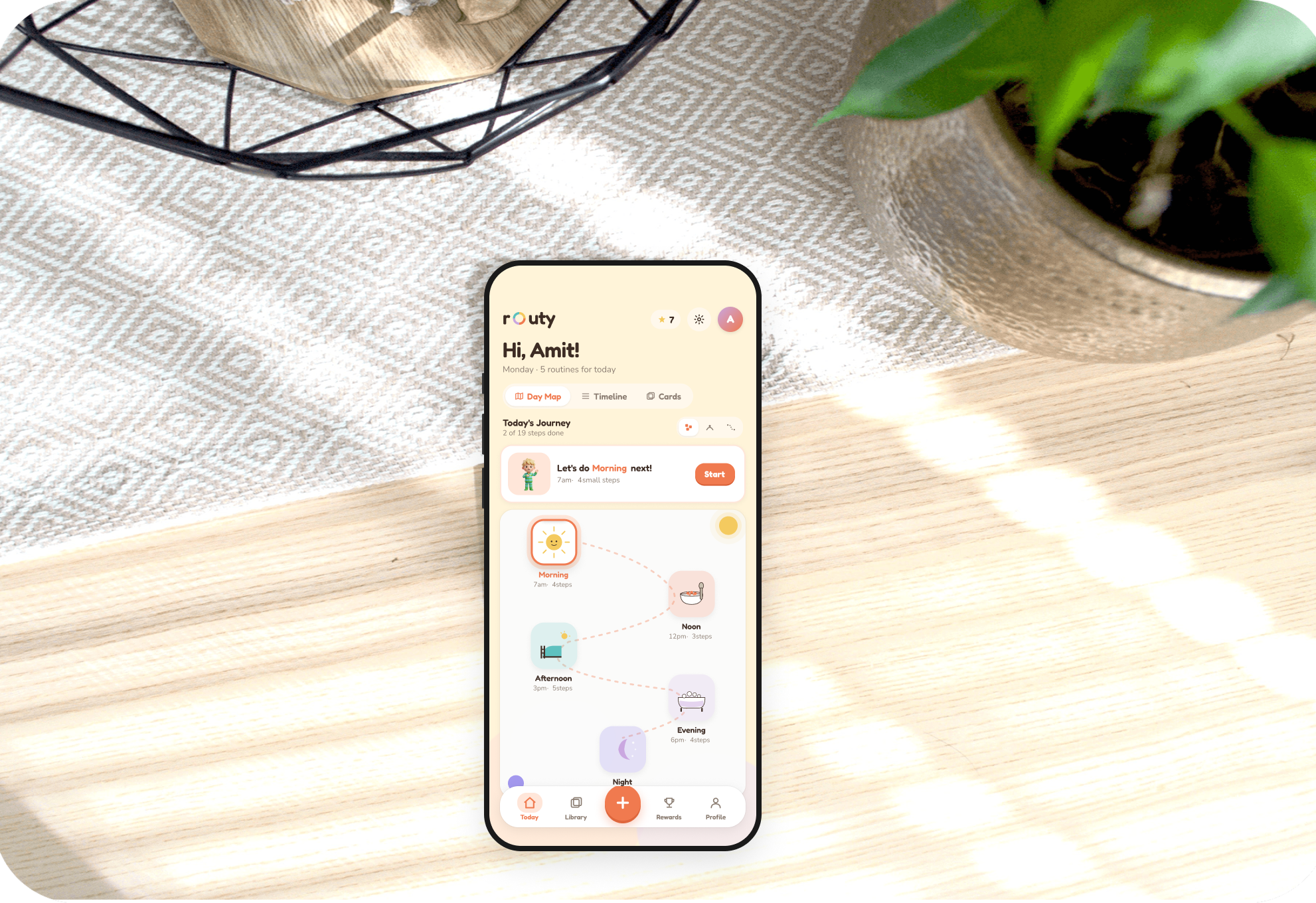
Routine Builder
An accessible app helping autistic individuals build and keep daily routines.
Read case study →.png)
MyCookBook
A personal recipe collection that centralizes, organizes, and shares dishes.
Read case study →